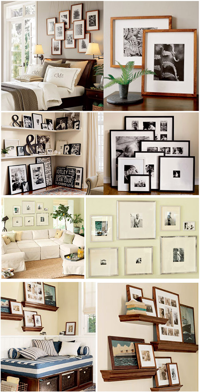
I just LOVE Pottery Barn. They make my life so much easier because they help tell people HOW to display their portraits and wall art in their homes. It can be tough to figure out which image goes where and how should I frame it? Where will the pictures hang? Should it match perfectly or be a hodge-podge? Will a mis-matched gallery look ok? Inspiration is everywhere and you don’t just have to use framed images. What about shelving with a clock or vase displayed as well? Why not create a 3-dimensional display using stacked frames or canvases?
I love using vintage containers with plants/flowers attached to the walls. Ballard Designs, Home Decorators Collection and Real Deals Decor always have great ideas and inexpensive options for adding texture and dimension to a wall series.
Here’s a few ideas from the latest PB catalog. Love! And don’t forget PB’s style house. A hidden gem of ideas that often gets overlooked!

Of course then you have to actually HANG the gallery on your wall. I highly recommend a stud finder. My DH found mine in his pocket. Tee hee!
Cool Julia! My name is Fern, and I use Ferns in my logo and marketing, so these Fern images in frames really appeal to me. I like this post. Thanks for sharing the Pottery Barn inspiration.
I gotta bookmark this web site it seems very beneficial very helpful